Turn any result into a chart without leaving FlexTable. Charts read the data already in the grid, so there is no re-query.

Open the chart view
With a table or query result loaded, switch from the Table tab to the Chart tab.
Click the Settings gear at the chart’s top-right to open the Series Settings panel:
- Chart type - bar, line, area, pie, or scatter.
- X axis - a category or date column.
- Y axis - one or more numeric measures, each with an aggregate (sum, avg, count, min, max).
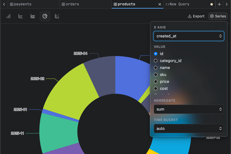
Sensible defaults. A chart appears immediately (first date/category becomes X, first numeric becomes Y); tweak from there. It visualizes exactly the rows you see, respecting any filters applied.

